Softop Solutions / Web Design
Redesigning the Digital Face of Softop Solutions
Redesigning the Digital Face of Softop Solutions
Redesigning the Digital Face of Softop Solutions
Task
UI / UX Design, Content Design, Development
Platform
Website
Tools
Figma, Antigravity
Timeline
2 Months, 2025
My Role
UI / UX Designer, Developer
Task
UI / UX Design, Content Design, Development
Platform
Website
Tools
Figma, Antigravity
Timeline
2 Months, 2025
My Role
UI / UX Designer, Developer
Task
UI / UX Design, Content Design, Development
Platform
Website
Tools
Figma, Antigravity
Timeline
2 Months, 2025
My Role
UI / UX Designer, Developer

Overview
Objective
The Problem
Information Architecture
Wireframes
Design Direction
Final Design
Reflection & Learnings
Overview
A website redesign focused on strengthening the company’s digital presence, communicating its capabilities clearly, and creating a more modern, credible brand experience.
Overview
A website redesign focused on strengthening the company’s digital presence, communicating its capabilities clearly, and creating a more modern, credible brand experience.
Overview
A website redesign focused on strengthening the company’s digital presence, communicating its capabilities clearly, and creating a more modern, credible brand experience.
Objective
Make Softop Solutions feel as capable online as it is behind the scenes.
Objective
Make Softop Solutions feel as capable online as it is behind the scenes.
Objective
Make Softop Solutions feel as capable online as it is behind the scenes.
The Problem
The existing website did not clearly communicate the company’s capabilities, products, or value proposition. The experience lacked a strong visual hierarchy and made it difficult for visitors to understand what Softop Solutions does and where its products fit.
The Problem
The existing website did not clearly communicate the company’s capabilities, products, or value proposition. The experience lacked a strong visual hierarchy and made it difficult for visitors to understand what Softop Solutions does and where its products fit.
The Problem
The existing website did not clearly communicate the company’s capabilities, products, or value proposition. The experience lacked a strong visual hierarchy and made it difficult for visitors to understand what Softop Solutions does and where its products fit.
Information Architecture
I reorganized the content around the questions visitors need answered first: who we are, what we build, how we work, and how to connect with us.

Information Architecture
I reorganized the content around the questions visitors need answered first: who we are, what we build, how we work, and how to connect with us.
Information Architecture
I reorganized the content around the questions visitors need answered first: who we are, what we build, how we work, and how to connect with us.
Wireframes
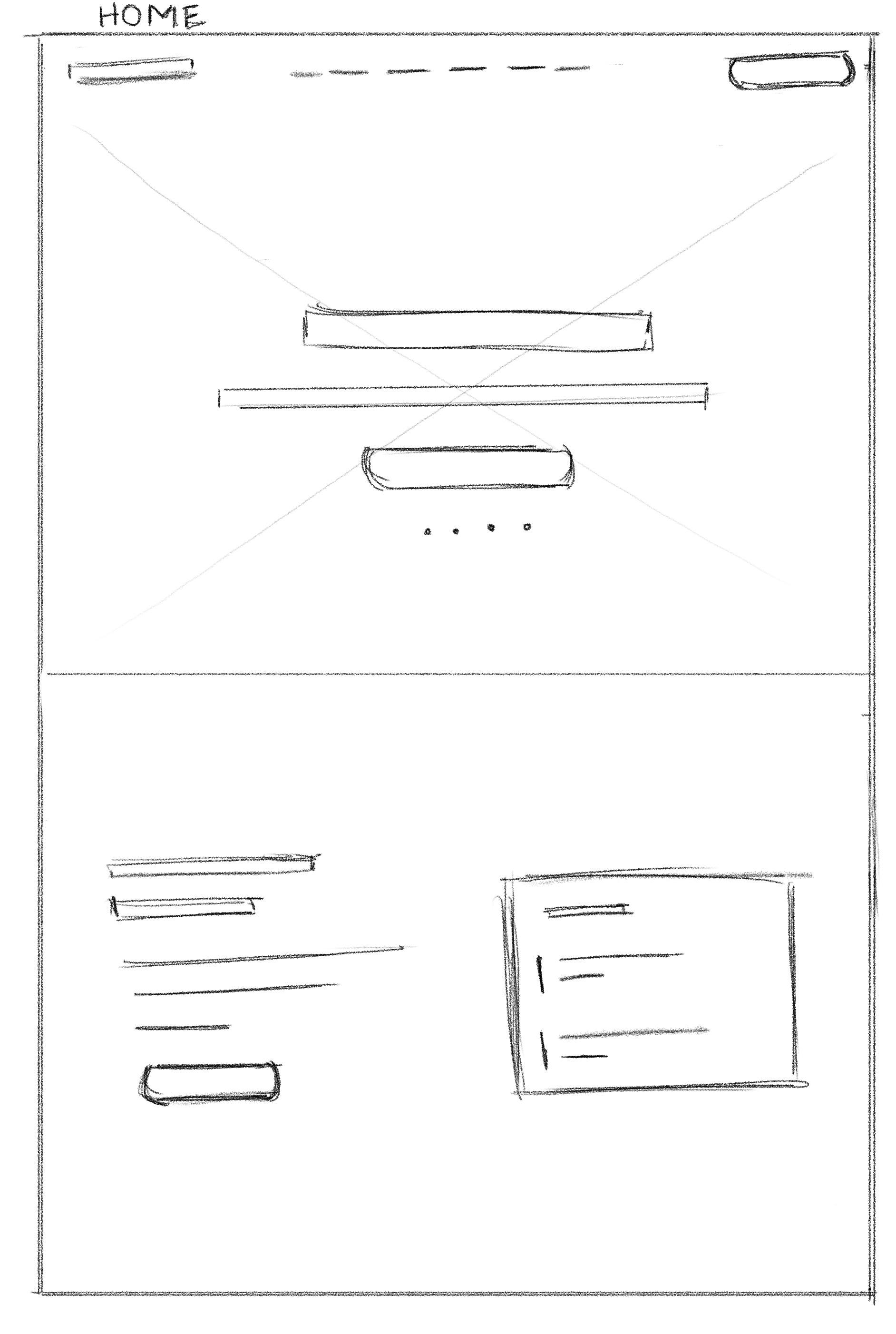
Explored multiple low-fidelity layouts to validate information hierarchy, content prioritization, and user flows before investing in visual design.

Wireframes
Explored multiple low-fidelity layouts to validate information hierarchy, content prioritization, and user flows before investing in visual design.
Wireframes
Explored multiple low-fidelity layouts to validate information hierarchy, content prioritization, and user flows before investing in visual design.
Design Direction
The visual direction combines a clean corporate foundation with a more modern, technology-focused aesthetic—using strong typography, immersive imagery, and focused CTAs to build credibility.
Typography

Color Tokens

Grid
Container: Bootstrap-style 12-column system built in Tailwind
Container max-widths: 540 / 720 / 960 / 1140 / 1320px at the sm / md / lg / xl / 2xl
Gutters: 32px (16px padding per column, negative-margin rows), 16px page gutter on mobile
Breakpoints: Tailwind defaults — 640 / 768 / 1024 / 1280 / 1536px
Section rhythm: 64px mobile / 96px desktop vertical padding; CTA sections go 96 → 128px
Components

Design Direction
The visual direction combines a clean corporate foundation with a more modern, technology-focused aesthetic—using strong typography, immersive imagery, and focused CTAs to build credibility.
Typography
Color Tokens
Grid
Container: Bootstrap-style 12-column system built in Tailwind
Container max-widths: 540 / 720 / 960 / 1140 / 1320px at the sm / md / lg / xl / 2xl
Gutters: 32px (16px padding per column, negative-margin rows), 16px page gutter on mobile
Breakpoints: Tailwind defaults — 640 / 768 / 1024 / 1280 / 1536px
Section rhythm: 64px mobile / 96px desktop vertical padding; CTA sections go 96 → 128px
Components
Design Direction
The visual direction combines a clean corporate foundation with a more modern, technology-focused aesthetic—using strong typography, immersive imagery, and focused CTAs to build credibility.
Typography
Color Tokens
Grid
Container: Bootstrap-style 12-column system built in Tailwind
Container max-widths: 540 / 720 / 960 / 1140 / 1320px at the sm / md / lg / xl / 2xl
Gutters: 32px (16px padding per column, negative-margin rows), 16px page gutter on mobile
Breakpoints: Tailwind defaults — 640 / 768 / 1024 / 1280 / 1536px
Section rhythm: 64px mobile / 96px desktop vertical padding; CTA sections go 96 → 128px
Components
Final Design
The redesigned experience creates a clearer brand story, stronger visual hierarchy, and a more direct journey from discovering Softop Solutions to exploring its products.
Hero — Establishing Brand Presence

Products — Showcasing the Product Ecosystem

The product experience presents eduegate as the company’s flagship solution.
Clear hierarchy and product-focused visuals help visitors understand its value quickly.
Engineering — Communicating Technical Expertise

This section explains the technology behind eduegate through a clear problem-to-solution narrative.
Structured content makes complex technical capabilities easier to understand.
Careers — Simplifying the Recruitment Journey

The careers experience makes open opportunities and contact options easy to discover.
A focused layout keeps the journey simple while maintaining the overall brand language.
Responsive by Design
Designed to maintain the same visual hierarchy and clarity across desktop, tablet, and mobile experiences.
Final Design
The redesigned experience creates a clearer brand story, stronger visual hierarchy, and a more direct journey from discovering Softop Solutions to exploring its products.
Hero — Establishing Brand Presence
Products — Showcasing the Product Ecosystem
The product experience presents eduegate as the company’s flagship solution.
Clear hierarchy and product-focused visuals help visitors understand its value quickly.
Engineering — Communicating Technical Expertise
This section explains the technology behind eduegate through a clear problem-to-solution narrative.
Structured content makes complex technical capabilities easier to understand.
Careers — Simplifying the Recruitment Journey
The careers experience makes open opportunities and contact options easy to discover.
A focused layout keeps the journey simple while maintaining the overall brand language.
Responsive by Design
Designed to maintain the same visual hierarchy and clarity across desktop, tablet, and mobile experiences.
Final Design
The redesigned experience creates a clearer brand story, stronger visual hierarchy, and a more direct journey from discovering Softop Solutions to exploring its products.
Hero — Establishing Brand Presence
Products — Showcasing the Product Ecosystem
The product experience presents eduegate as the company’s flagship solution.
Clear hierarchy and product-focused visuals help visitors understand its value quickly.
Engineering — Communicating Technical Expertise
This section explains the technology behind eduegate through a clear problem-to-solution narrative.
Structured content makes complex technical capabilities easier to understand.
Careers — Simplifying the Recruitment Journey
The careers experience makes open opportunities and contact options easy to discover.
A focused layout keeps the journey simple while maintaining the overall brand language.
Responsive by Design
Designed to maintain the same visual hierarchy and clarity across desktop, tablet, and mobile experiences.
Reflection & Learnings
I learned that a company website isn’t just about presenting information—it shapes how people perceive the company.
Good design makes capability feel credible.
Reflection & Learnings
I learned that a company website isn’t just about presenting information—it shapes how people perceive the company.
Good design makes capability feel credible.
Reflection & Learnings
I learned that a company website isn’t just about presenting information—it shapes how people perceive the company.
Good design makes capability feel credible.

