Eduegate / Web Design
Making a Complex School Platform Easier to Understand
Making a Complex School Platform Easier to Understand
Making a Complex School Platform Easier to Understand
Task
UI / UX Design, Content Design, Development
Platform
Website
Tools
Figma, Antigravity
Timeline
2 Months, 2025
My Role
UI / UX Designer, Developer
Task
UI / UX Design, Content Design, Development
Platform
Website
Tools
Figma, Antigravity
Timeline
2 Months, 2025
My Role
UI / UX Designer, Developer
Task
UI / UX Design, Content Design, Development
Platform
Website
Tools
Figma, Antigravity
Timeline
2 Months, 2025
My Role
UI / UX Designer, Developer

Overview
The Challenges
Information Architecture
Wireframes
Design Direction
Final Design
Reflection & Learnings
Overview
I designed the eduegate product website to communicate its extensive school-management ecosystem through a clearer content hierarchy, stronger product storytelling, and focused conversion paths.
Overview
I designed the eduegate product website to communicate its extensive school-management ecosystem through a clearer content hierarchy, stronger product storytelling, and focused conversion paths.
Overview
I designed the eduegate product website to communicate its extensive school-management ecosystem through a clearer content hierarchy, stronger product storytelling, and focused conversion paths.
The Challenges
eduegate brings multiple school operations into one platform—from academics and admissions to finance, communication, and administration. The challenge was turning that breadth into a website that visitors could understand quickly and navigate with confidence.
The Challenges
eduegate brings multiple school operations into one platform—from academics and admissions to finance, communication, and administration. The challenge was turning that breadth into a website that visitors could understand quickly and navigate with confidence.
The Challenges
eduegate brings multiple school operations into one platform—from academics and admissions to finance, communication, and administration. The challenge was turning that breadth into a website that visitors could understand quickly and navigate with confidence.
Content & Information Architecture
I structured the website around user intent, grouping products, services, and resources into clear navigation paths to make the platform easier to explore.

Content & Information Architecture
I structured the website around user intent, grouping products, services, and resources into clear navigation paths to make the platform easier to explore.
Content & Information Architecture
I structured the website around user intent, grouping products, services, and resources into clear navigation paths to make the platform easier to explore.
Wireframes
Explored multiple low-fidelity layouts to validate information hierarchy, content prioritization, and user flows before investing in visual design.

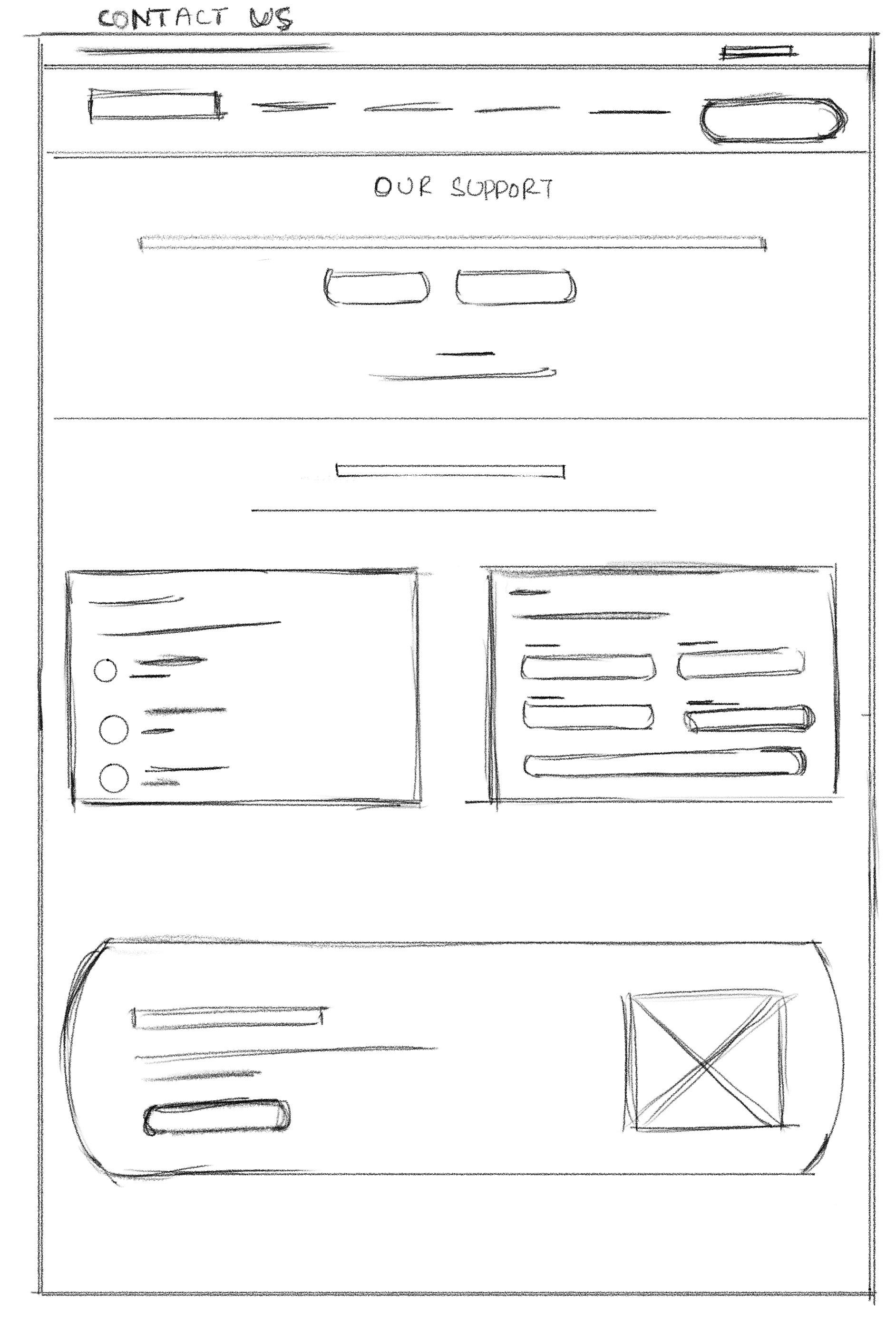
Wireframes
Explored multiple low-fidelity layouts to validate information hierarchy, content prioritization, and user flows before investing in visual design.
Wireframes
Explored multiple low-fidelity layouts to validate information hierarchy, content prioritization, and user flows before investing in visual design.
Design Direction
The visual system uses a restrained palette, strong typography, and product-led imagery to make the platform feel credible while keeping the experience approachable.
Typography

Color Tokens

Grid
Container: 1280–1320px max width (most sections use 1280px / 1298px / 1320px), centered with auto margins
Gutters: 16px on mobile (
px-4), 20px page frame on desktopBreakpoints: Tailwind defaults — 640 / 768 / 1024 / 1280 / 1536px
Column Behavior: 1 column mobile → 2 tablet → 3–4 desktop; grid gaps of 16–32px (
gap-4togap-8)Vertical Rhythm: section padding scales roughly 48px (mobile) → 80–128px (desktop), hero top padding 60 → 158px
Components

Design Direction
The visual system uses a restrained palette, strong typography, and product-led imagery to make the platform feel credible while keeping the experience approachable.
Typography
Color Tokens
Grid
Container: 1280–1320px max width (most sections use 1280px / 1298px / 1320px), centered with auto margins
Gutters: 16px on mobile (
px-4), 20px page frame on desktopBreakpoints: Tailwind defaults — 640 / 768 / 1024 / 1280 / 1536px
Column Behavior: 1 column mobile → 2 tablet → 3–4 desktop; grid gaps of 16–32px (
gap-4togap-8)Vertical Rhythm: section padding scales roughly 48px (mobile) → 80–128px (desktop), hero top padding 60 → 158px
Components
Design Direction
The visual system uses a restrained palette, strong typography, and product-led imagery to make the platform feel credible while keeping the experience approachable.
Typography
Color Tokens
Grid
Container: 1280–1320px max width (most sections use 1280px / 1298px / 1320px), centered with auto margins
Gutters: 16px on mobile (
px-4), 20px page frame on desktopBreakpoints: Tailwind defaults — 640 / 768 / 1024 / 1280 / 1536px
Column Behavior: 1 column mobile → 2 tablet → 3–4 desktop; grid gaps of 16–32px (
gap-4togap-8)Vertical Rhythm: section padding scales roughly 48px (mobile) → 80–128px (desktop), hero top padding 60 → 158px
Components
Final Design
The final website brings the product ecosystem together through a clear visual hierarchy, focused content structure, and consistent interaction patterns. The experience balances product storytelling with clear calls to action, making the platform easier to understand, explore, and engage with.
Hero Section

Demo booking form

A focused demo request flow that makes it simple for institutions to share their details and connect with the eduegate team.
Responsive by Design
The interface adapts seamlessly across screen sizes, preserving hierarchy, navigation, and essential interactions as the layout transitions from desktop to smaller screens.
Final Design
The final website brings the product ecosystem together through a clear visual hierarchy, focused content structure, and consistent interaction patterns. The experience balances product storytelling with clear calls to action, making the platform easier to understand, explore, and engage with.
Hero Section
Demo booking form
A focused demo request flow that makes it simple for institutions to share their details and connect with the eduegate team.
Responsive by Design
The interface adapts seamlessly across screen sizes, preserving hierarchy, navigation, and essential interactions as the layout transitions from desktop to smaller screens.
Final Design
The final website brings the product ecosystem together through a clear visual hierarchy, focused content structure, and consistent interaction patterns. The experience balances product storytelling with clear calls to action, making the platform easier to understand, explore, and engage with.
Hero Section
Demo booking form
A focused demo request flow that makes it simple for institutions to share their details and connect with the eduegate team.
Responsive by Design
The interface adapts seamlessly across screen sizes, preserving hierarchy, navigation, and essential interactions as the layout transitions from desktop to smaller screens.
Reflection & Learnings
This project reinforced that good product design is often about reducing complexity rather than adding more. By validating the structure before moving into visual design, I was able to create clearer navigation, more consistent interactions, and a more cohesive experience across the website.
It also taught me to think beyond individual screens—to consider how information architecture, design systems, accessibility, and real-world constraints work together to shape a product.
This project strengthened my approach to designing systems rather than isolated screens—and reminded me to always design around the user’s everyday context.
Reflection & Learnings
This project reinforced that good product design is often about reducing complexity rather than adding more. By validating the structure before moving into visual design, I was able to create clearer navigation, more consistent interactions, and a more cohesive experience across the website.
It also taught me to think beyond individual screens—to consider how information architecture, design systems, accessibility, and real-world constraints work together to shape a product.
This project strengthened my approach to designing systems rather than isolated screens—and reminded me to always design around the user’s everyday context.
Reflection & Learnings
This project reinforced that good product design is often about reducing complexity rather than adding more. By validating the structure before moving into visual design, I was able to create clearer navigation, more consistent interactions, and a more cohesive experience across the website.
It also taught me to think beyond individual screens—to consider how information architecture, design systems, accessibility, and real-world constraints work together to shape a product.
This project strengthened my approach to designing systems rather than isolated screens—and reminded me to always design around the user’s everyday context.

