Parent Portal / Enterprise UX
Redesigning a School Parent Portal for Everyday Parents
Redesigning a School Parent Portal for Everyday Parents
Redesigning a School Parent Portal for Everyday Parents
Task
UX, Research, Wireframing, Prototyping, Testing, Development
Platform
Website
Tools
Figma, Antigravity, Claude
Timeline
3 Months, 2026
My Role
Product Designer
Task
UX, Research, Wireframing, Prototyping, Testing, Development
Platform
Website
Tools
Figma, Antigravity, Claude
Timeline
3 Months, 2026
My Role
Product Designer
Task
UX, Research, Wireframing, Prototyping, Testing, Development
Platform
Website
Tools
Figma, Antigravity, Claude
Timeline
3 Months, 2026
My Role
Product Designer
Overview
Objective
Problem Statement
Challenges & Scope
Research & Discovery
Insights
Information Architecture
Key User Flow
Wireframes
Design Direction
Final Design
Reflection & Learnings
Overview
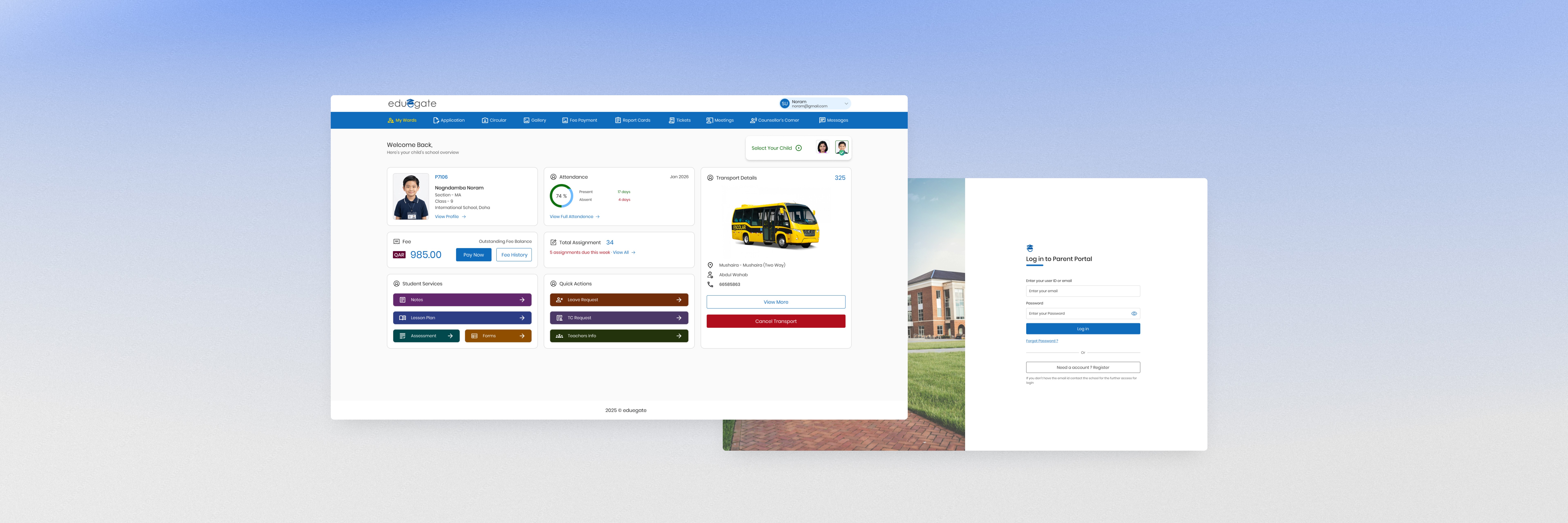
eduegate Parent Portal is part of the eduegate School ERP ecosystem, designed to help parents manage every aspect of their child’s school journey through a unified digital experience. From monitoring attendance and academic progress to paying fees, accessing transport information, requesting services, and communicating with the school, the portal consolidates multiple touchpoints into a single platform. By reducing reliance on offline processes and scattered communication channels, it enables parents to stay informed and engaged throughout the academic year.
Overview
eduegate Parent Portal is part of the eduegate School ERP ecosystem, designed to help parents manage every aspect of their child’s school journey through a unified digital experience. From monitoring attendance and academic progress to paying fees, accessing transport information, requesting services, and communicating with the school, the portal consolidates multiple touchpoints into a single platform. By reducing reliance on offline processes and scattered communication channels, it enables parents to stay informed and engaged throughout the academic year.
Overview
eduegate Parent Portal is part of the eduegate School ERP ecosystem, designed to help parents manage every aspect of their child’s school journey through a unified digital experience. From monitoring attendance and academic progress to paying fees, accessing transport information, requesting services, and communicating with the school, the portal consolidates multiple touchpoints into a single platform. By reducing reliance on offline processes and scattered communication channels, it enables parents to stay informed and engaged throughout the academic year.
Objective
The objective of this project was to redesign the eduegate Parent Portal to create a simpler, more intuitive experience for parents. The focus was on improving information architecture, prioritizing frequently used tasks, reducing interface complexity, and building a scalable foundation that could support future product growth across the eduegate ecosystem.
Objective
The objective of this project was to redesign the eduegate Parent Portal to create a simpler, more intuitive experience for parents. The focus was on improving information architecture, prioritizing frequently used tasks, reducing interface complexity, and building a scalable foundation that could support future product growth across the eduegate ecosystem.
Objective
The objective of this project was to redesign the eduegate Parent Portal to create a simpler, more intuitive experience for parents. The focus was on improving information architecture, prioritizing frequently used tasks, reducing interface complexity, and building a scalable foundation that could support future product growth across the eduegate ecosystem.
Problem Statement
Over time, the Parent Portal had evolved by adding new features and modules without a consistent organizational strategy. While it offered a wide range of functionality, the experience had become increasingly difficult for parents to navigate. Important tasks were often buried behind multiple layers, information was scattered across the interface, and the overall experience lacked a clear hierarchy.

Problem Statement
Over time, the Parent Portal had evolved by adding new features and modules without a consistent organizational strategy. While it offered a wide range of functionality, the experience had become increasingly difficult for parents to navigate. Important tasks were often buried behind multiple layers, information was scattered across the interface, and the overall experience lacked a clear hierarchy.
Problem Statement
Over time, the Parent Portal had evolved by adding new features and modules without a consistent organizational strategy. While it offered a wide range of functionality, the experience had become increasingly difficult for parents to navigate. Important tasks were often buried behind multiple layers, information was scattered across the interface, and the overall experience lacked a clear hierarchy.
Challenges & Scope
Each problem the audit surfaced set the boundary for what the redesign had to solve.
Challenges
Scope
Information Architecture
The Parent Portal had evolved over time with new modules added incrementally. As the product grew, navigation became increasingly difficult, making it harder for parents to locate frequently used features.
Simplify Navigation
Reorganize the information architecture around parents’ everyday tasks, making frequently accessed features easier to discover and reducing the number of steps required.
Dashboard Hierarchy
Important information such as attendance, fees, assignments, and transport competed equally with secondary content, making it difficult for parents to quickly identify what mattered most.
Prioritize High-Frequency Tasks
Design a dashboard that surfaces the most important information first, allowing parents to understand their child’s school status at a glance.
Visual Consistency
Different modules used inconsistent layouts, spacing, and component patterns, creating an experience that felt fragmented.
Create a Unified Design System
Introduce reusable components and consistent interaction patterns to improve usability and support future product growth.
Growing Product Complexity
As additional modules were introduced, the existing interface became harder to scale without increasing cognitive load.
Design for Scalability
Build a modular layout and component structure capable of supporting new features while maintaining clarity and consistency.
Parent Efficiency
Routine tasks such as checking attendance, paying fees, or viewing assignments required unnecessary navigation and increased interaction effort.
Reduce Interaction Friction
Bring common tasks closer to the homepage and streamline key workflows to help parents complete everyday actions more efficiently.



Challenges & Scope
Each problem the audit surfaced set the boundary for what the redesign had to solve.
Challenges
Scope
Information Architecture
The Parent Portal had evolved over time with new modules added incrementally. As the product grew, navigation became increasingly difficult, making it harder for parents to locate frequently used features.
Simplify Navigation
Reorganize the information architecture around parents’ everyday tasks, making frequently accessed features easier to discover and reducing the number of steps required.
Dashboard Hierarchy
Important information such as attendance, fees, assignments, and transport competed equally with secondary content, making it difficult for parents to quickly identify what mattered most.
Prioritize High-Frequency Tasks
Design a dashboard that surfaces the most important information first, allowing parents to understand their child’s school status at a glance.
Visual Consistency
Different modules used inconsistent layouts, spacing, and component patterns, creating an experience that felt fragmented.
Create a Unified Design System
Introduce reusable components and consistent interaction patterns to improve usability and support future product growth.
Growing Product Complexity
As additional modules were introduced, the existing interface became harder to scale without increasing cognitive load.
Design for Scalability
Build a modular layout and component structure capable of supporting new features while maintaining clarity and consistency.
Parent Efficiency
Routine tasks such as checking attendance, paying fees, or viewing assignments required unnecessary navigation and increased interaction effort.
Reduce Interaction Friction
Bring common tasks closer to the homepage and streamline key workflows to help parents complete everyday actions more efficiently.
Challenges & Scope
Each problem the audit surfaced set the boundary for what the redesign had to solve.
Challenges
Scope
Information Architecture
The Parent Portal had evolved over time with new modules added incrementally. As the product grew, navigation became increasingly difficult, making it harder for parents to locate frequently used features.
Simplify Navigation
Reorganize the information architecture around parents’ everyday tasks, making frequently accessed features easier to discover and reducing the number of steps required.
Dashboard Hierarchy
Important information such as attendance, fees, assignments, and transport competed equally with secondary content, making it difficult for parents to quickly identify what mattered most.
Prioritize High-Frequency Tasks
Design a dashboard that surfaces the most important information first, allowing parents to understand their child’s school status at a glance.
Visual Consistency
Different modules used inconsistent layouts, spacing, and component patterns, creating an experience that felt fragmented.
Create a Unified Design System
Introduce reusable components and consistent interaction patterns to improve usability and support future product growth.
Growing Product Complexity
As additional modules were introduced, the existing interface became harder to scale without increasing cognitive load.
Design for Scalability
Build a modular layout and component structure capable of supporting new features while maintaining clarity and consistency.
Parent Efficiency
Routine tasks such as checking attendance, paying fees, or viewing assignments required unnecessary navigation and increased interaction effort.
Reduce Interaction Friction
Bring common tasks closer to the homepage and streamline key workflows to help parents complete everyday actions more efficiently.
Research & Discovery
Before exploring design solutions, I reviewed the existing Parent Portal to understand how parents interacted with the product, identify usability issues, and uncover opportunities for improving everyday workflows. This phase combined stakeholder discussions, product analysis, and a review of existing user journeys.
01
Product Audit
Reviewed the existing portal to identify usability issues, inconsistent patterns, and navigation challenges.
02
Stakeholder Discussions
Worked with product stakeholders to understand business priorities, existing constraints, and planned feature expansion.
03
Workflow Analysis
Mapped the most common parent tasks to identify where users spent the most time and where friction occurred.
04
Comparative Analysis
Reviewed modern products to understand effective navigation, dashboard layouts, and information hierarchy.
Primary Users
Parents & Guardians
Age: 35-55
Mixed technical proficiency
Daily usage
Goals
Monitor attendance
Pay school fees
Track academic progress
Communicate with the school
Access transport information
Key User Tasks
Task
Frequency
Priority
Current Pain
Check attendance
Frequency
Daily
Priority
High
Current Pain
Navigation
View assignments
Frequency
Daily
Priority
High
Current Pain
Too many steps
Pay fees
Frequency
Monthly
Priority
High
Current Pain
Hidden
Track transport
Frequency
Daily
Priority
High
Current Pain
Hidden
Read announcements
Frequency
Weekly
Priority
Medium
Current Pain
Hidden
Download report cards
Frequency
Term-wise
Priority
Medium
Current Pain
Hidden
Submit leave requests
Frequency
Occasionally
Priority
Low
Current Pain
Hidden
Research & Discovery
Before exploring design solutions, I reviewed the existing Parent Portal to understand how parents interacted with the product, identify usability issues, and uncover opportunities for improving everyday workflows. This phase combined stakeholder discussions, product analysis, and a review of existing user journeys.
01
Product Audit
Reviewed the existing portal to identify usability issues, inconsistent patterns, and navigation challenges.
02
Stakeholder Discussions
Worked with product stakeholders to understand business priorities, existing constraints, and planned feature expansion.
03
Workflow Analysis
Mapped the most common parent tasks to identify where users spent the most time and where friction occurred.
04
Comparative Analysis
Reviewed modern products to understand effective navigation, dashboard layouts, and information hierarchy.
Primary Users
Parents & Guardians
Age: 35-55
Mixed technical proficiency
Daily usage
Goals
Monitor attendance
Pay school fees
Track academic progress
Communicate with the school
Access transport information
Key User Tasks
Task
Frequency
Priority
Current Pain
Check attendance
Frequency
Daily
Priority
High
Current Pain
Navigation
View assignments
Frequency
Daily
Priority
High
Current Pain
Too many steps
Pay fees
Frequency
Monthly
Priority
High
Current Pain
Hidden
Track transport
Frequency
Daily
Priority
High
Current Pain
Hidden
Read announcements
Frequency
Weekly
Priority
Medium
Current Pain
Hidden
Download report cards
Frequency
Term-wise
Priority
Medium
Current Pain
Hidden
Submit leave requests
Frequency
Occasionally
Priority
Low
Current Pain
Hidden
Research & Discovery
Before exploring design solutions, I reviewed the existing Parent Portal to understand how parents interacted with the product, identify usability issues, and uncover opportunities for improving everyday workflows. This phase combined stakeholder discussions, product analysis, and a review of existing user journeys.
01
Product Audit
Reviewed the existing portal to identify usability issues, inconsistent patterns, and navigation challenges.
02
Stakeholder Discussions
Worked with product stakeholders to understand business priorities, existing constraints, and planned feature expansion.
03
Workflow Analysis
Mapped the most common parent tasks to identify where users spent the most time and where friction occurred.
04
Comparative Analysis
Reviewed modern products to understand effective navigation, dashboard layouts, and information hierarchy.
Primary Users
Parents & Guardians
Age: 35-55
Mixed technical proficiency
Daily usage
Goals
Monitor attendance
Pay school fees
Track academic progress
Communicate with the school
Access transport information
Key User Tasks
Task
Frequency
Priority
Current Pain
Check attendance
Frequency
Daily
Priority
High
Current Pain
Navigation
View assignments
Frequency
Daily
Priority
High
Current Pain
Too many steps
Pay fees
Frequency
Monthly
Priority
High
Current Pain
Hidden
Track transport
Frequency
Daily
Priority
High
Current Pain
Hidden
Read announcements
Frequency
Weekly
Priority
Medium
Current Pain
Hidden
Download report cards
Frequency
Term-wise
Priority
Medium
Current Pain
Hidden
Submit leave requests
Frequency
Occasionally
Priority
Low
Current Pain
Hidden
Insights
1
Parents primarily visit the portal to complete a small number of recurring tasks rather than exploring all available modules.
2
Important information was difficult to locate because navigation and dashboard hierarchy did not reflect real usage patterns.
3
The portal contained many features, but their organization increased cognitive load instead of helping users complete tasks efficiently.
4
A consistent design language would improve familiarity and make the product easier to scale.
Insight
Opportunity
Parents focus on recurring tasks
Prioritize high-frequency actions on the dashboard
Navigation was difficult
Reorganize information architecture
Dashboard lacked hierarchy
Create modular, task-focused cards
Inconsistent UI
Build a reusable component system
Product continuing to grow
Design for scalability
Insights
1
Parents primarily visit the portal to complete a small number of recurring tasks rather than exploring all available modules.
2
Important information was difficult to locate because navigation and dashboard hierarchy did not reflect real usage patterns.
3
The portal contained many features, but their organization increased cognitive load instead of helping users complete tasks efficiently.
4
A consistent design language would improve familiarity and make the product easier to scale.
Insight
Opportunity
Parents focus on recurring tasks
Prioritize high-frequency actions on the dashboard
Navigation was difficult
Reorganize information architecture
Dashboard lacked hierarchy
Create modular, task-focused cards
Inconsistent UI
Build a reusable component system
Product continuing to grow
Design for scalability
Insights
1
Parents primarily visit the portal to complete a small number of recurring tasks rather than exploring all available modules.
2
Important information was difficult to locate because navigation and dashboard hierarchy did not reflect real usage patterns.
3
The portal contained many features, but their organization increased cognitive load instead of helping users complete tasks efficiently.
4
A consistent design language would improve familiarity and make the product easier to scale.
Insight
Opportunity
Parents focus on recurring tasks
Prioritize high-frequency actions on the dashboard
Navigation was difficult
Reorganize information architecture
Dashboard lacked hierarchy
Create modular, task-focused cards
Inconsistent UI
Build a reusable component system
Product continuing to grow
Design for scalability
Information Architecture
Reorganized the portal around parents’ most frequent tasks, creating a clearer navigation structure that improves discoverability, reduces cognitive load, and supports future product growth.
Old Structure

Problems
13+ navigation items
Feature-based navigation
Inconsistent grouping
High cognitive load
New Structure

Fixes
Task-focused hierarchy
Logical grouping
Reduced scanning
Scalable structure
New Task Priority
Child Overview
Attendance
Fees
Assignments
Transport
Services
Communication
Information Architecture
Reorganized the portal around parents’ most frequent tasks, creating a clearer navigation structure that improves discoverability, reduces cognitive load, and supports future product growth.
Old Structure
Problems
13+ navigation items
Feature-based navigation
Inconsistent grouping
High cognitive load
New Structure
Fixes
Task-focused hierarchy
Logical grouping
Reduced scanning
Scalable structure
New Task Priority
Child Overview
Attendance
Fees
Assignments
Transport
Services
Communication
Information Architecture
Reorganized the portal around parents’ most frequent tasks, creating a clearer navigation structure that improves discoverability, reduces cognitive load, and supports future product growth.
Old Structure
Problems
13+ navigation items
Feature-based navigation
Inconsistent grouping
High cognitive load
New Structure
Fixes
Task-focused hierarchy
Logical grouping
Reduced scanning
Scalable structure
New Task Priority
Child Overview
Attendance
Fees
Assignments
Transport
Services
Communication
Key User Flow
I mapped the most common parent journeys to simplify navigation, reduce friction, and prioritize high-frequency tasks.

User Goal
Flow
Design Opportunity
Check Attendance
Flow
Login → Dashboard → Attendance
Design Opportunity
Surface attendance on the homepage
Pay Fees
Flow
Dashboard → Pay Now → Payment
Design Opportunity
Reduce payment steps
Track Transport
Flow
Dashboard → Transport
Design Opportunity
Show route summary before details
View Assignments
Flow
Dashboard → Assignments
Design Opportunity
Prioritize active assignments
Submit Leave
Flow
Dashboard → Leave Request
Design Opportunity
Place in Quick Actions
Key User Flow
I mapped the most common parent journeys to simplify navigation, reduce friction, and prioritize high-frequency tasks.
User Goal
Flow
Design Opportunity
Check Attendance
Flow
Login → Dashboard → Attendance
Design Opportunity
Surface attendance on the homepage
Pay Fees
Flow
Dashboard → Pay Now → Payment
Design Opportunity
Reduce payment steps
Track Transport
Flow
Dashboard → Transport
Design Opportunity
Show route summary before details
View Assignments
Flow
Dashboard → Assignments
Design Opportunity
Prioritize active assignments
Submit Leave
Flow
Dashboard → Leave Request
Design Opportunity
Place in Quick Actions
Key User Flow
I mapped the most common parent journeys to simplify navigation, reduce friction, and prioritize high-frequency tasks.
User Goal
Flow
Design Opportunity
Check Attendance
Flow
Login → Dashboard → Attendance
Design Opportunity
Surface attendance on the homepage
Pay Fees
Flow
Dashboard → Pay Now → Payment
Design Opportunity
Reduce payment steps
Track Transport
Flow
Dashboard → Transport
Design Opportunity
Show route summary before details
View Assignments
Flow
Dashboard → Assignments
Design Opportunity
Prioritize active assignments
Submit Leave
Flow
Dashboard → Leave Request
Design Opportunity
Place in Quick Actions
Wireframes
Explored multiple low-fidelity layouts to validate information hierarchy, content prioritization, and user flows before investing in visual design.

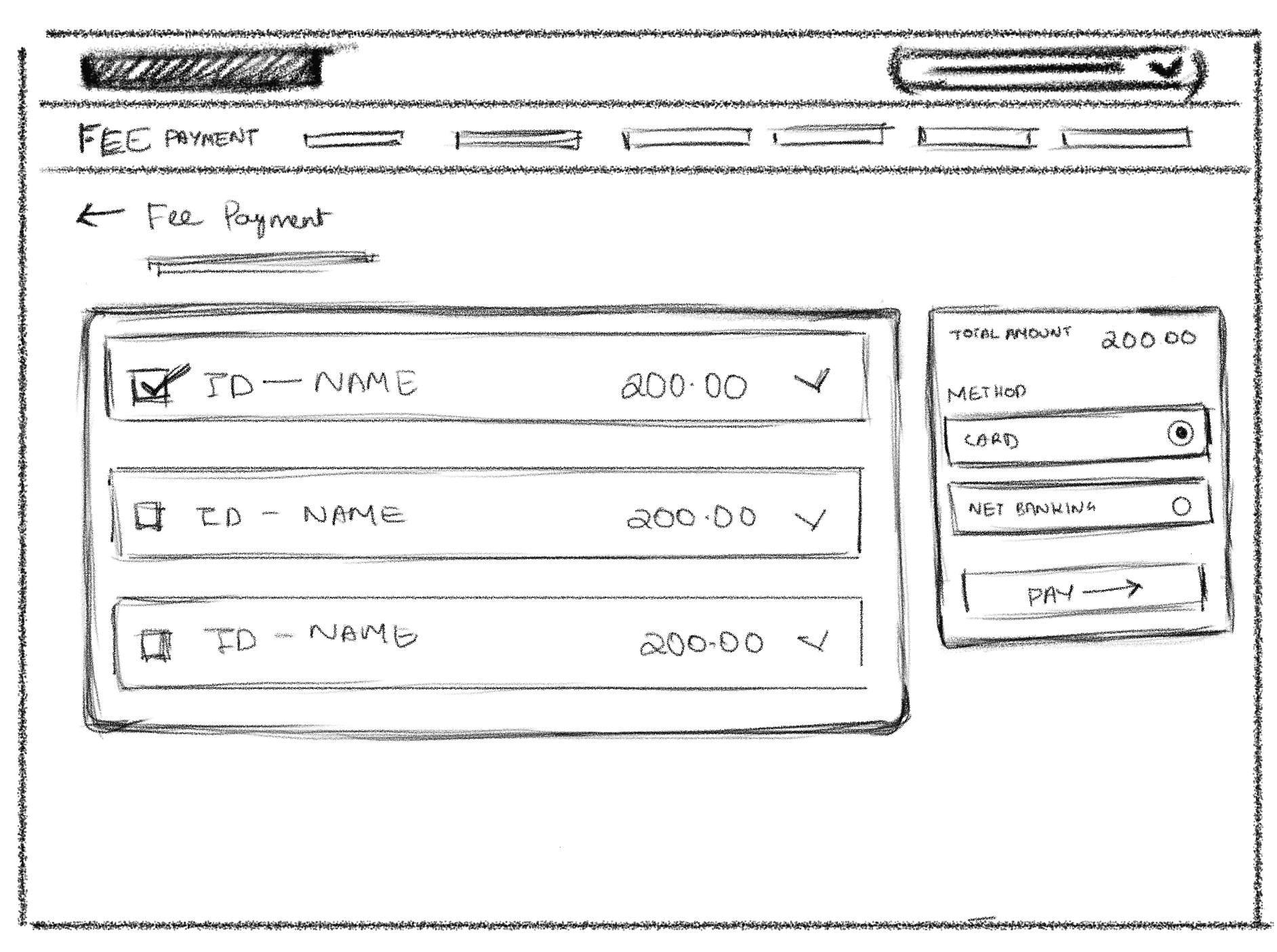


Wireframes
Explored multiple low-fidelity layouts to validate information hierarchy, content prioritization, and user flows before investing in visual design.
Wireframes
Explored multiple low-fidelity layouts to validate information hierarchy, content prioritization, and user flows before investing in visual design.
Design Direction
With the information architecture and key workflows established, I defined a visual system that makes the portal easier to scan, navigate, and use across everyday parent tasks.
Color Tokens

Typography

Components

Design Direction
With the information architecture and key workflows established, I defined a visual system that makes the portal easier to scan, navigate, and use across everyday parent tasks.
Color Tokens
Typography
Components
Design Direction
With the information architecture and key workflows established, I defined a visual system that makes the portal easier to scan, navigate, and use across everyday parent tasks.
Color Tokens
Typography
Components
Final Design
The final interface builds on the validated structure, prioritizing the tasks parents use most while creating a clearer hierarchy and consistent interaction patterns across the portal.
Dashboard
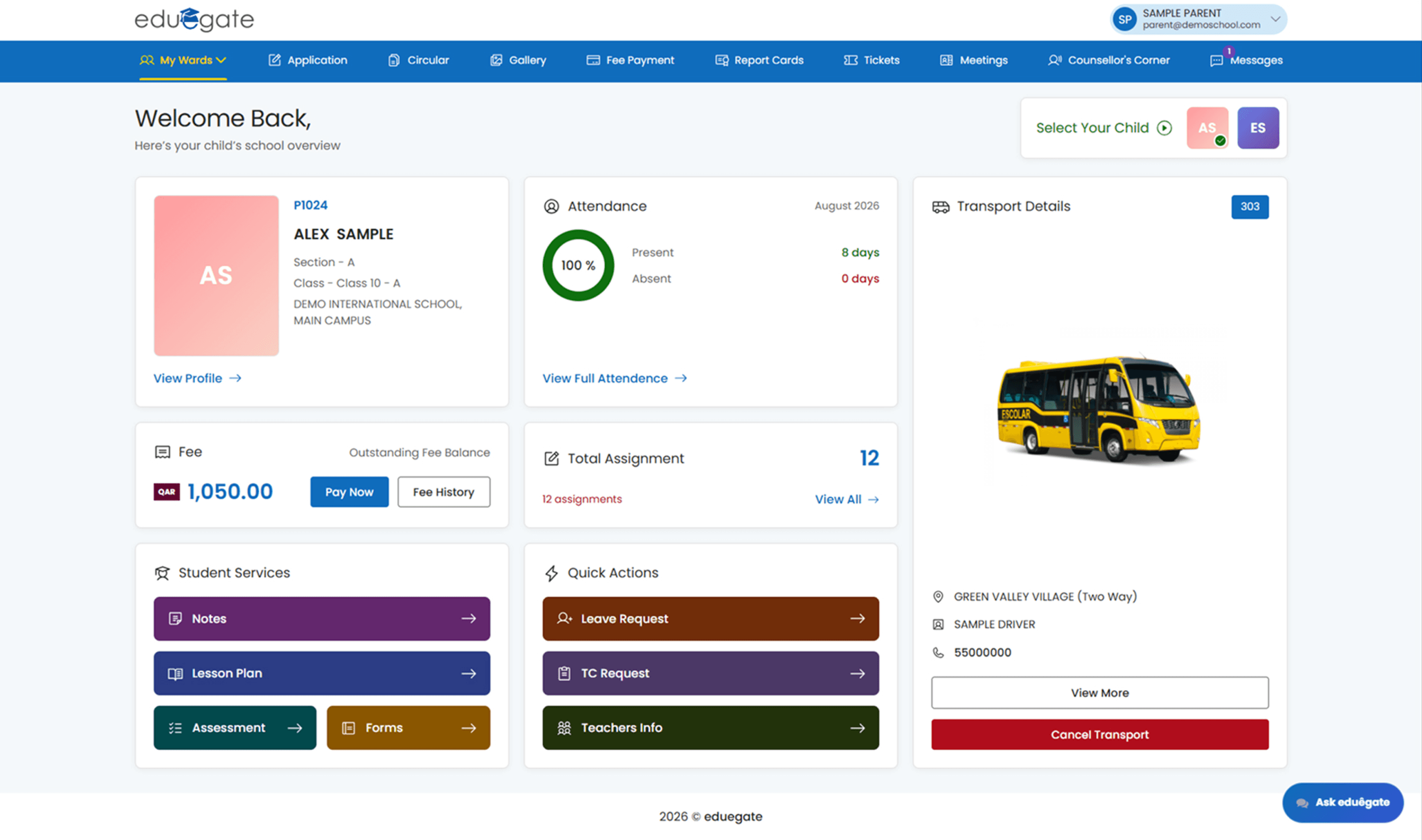
The dashboard prioritizes the tasks parents access most frequently—attendance, fees, assignments, transport, and quick actions—so key information is available from a single overview.


Attendance Overview

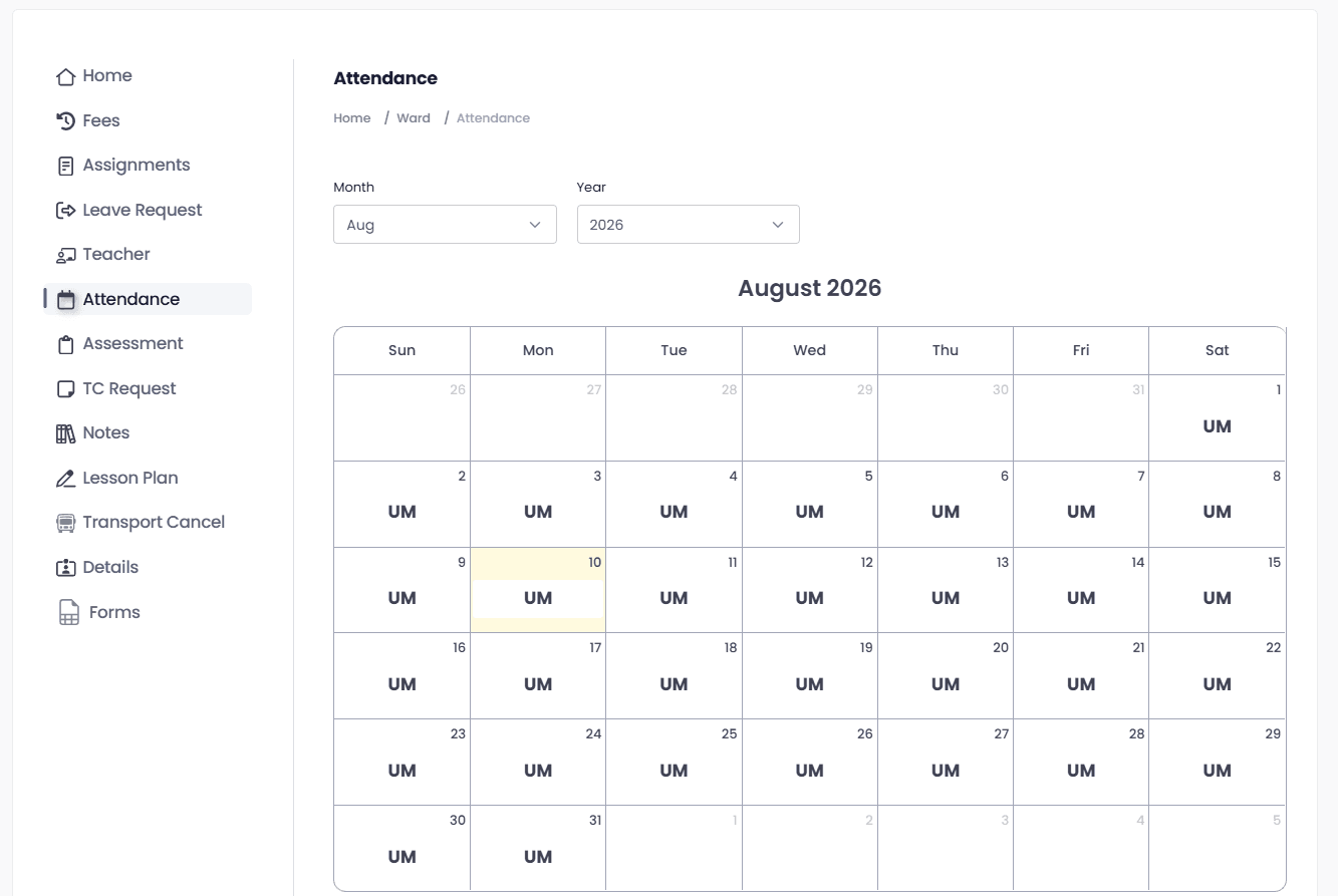
Attendance was brought closer to the dashboard, reducing navigation and giving parents an immediate view of their child’s attendance status.

Fee Payment


Fee information was consolidated into a clearer payment flow, making outstanding balances, payment actions, and transaction history easier to scan and manage.
Assignments

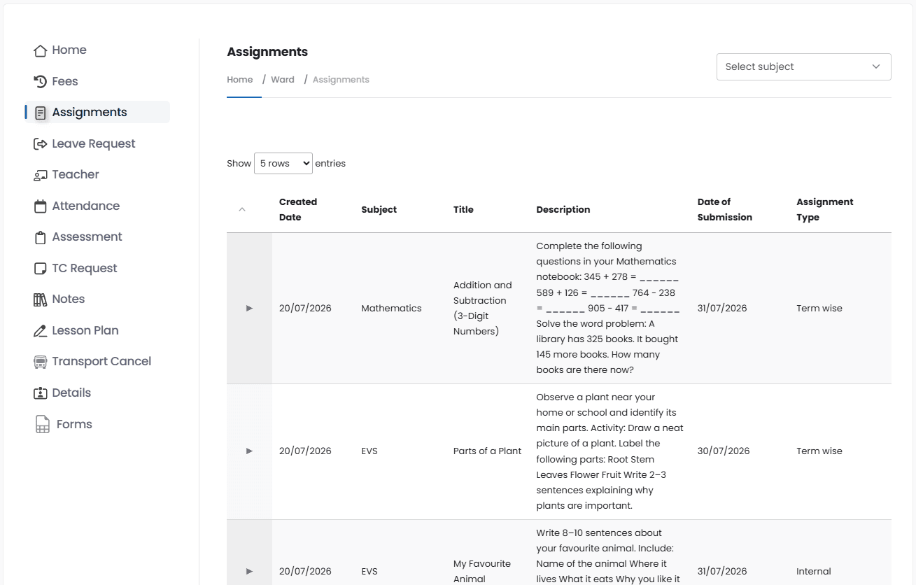
Assignments were organized into scannable cards, allowing parents to quickly identify subjects, deadlines, and assignment status without opening each item.
Leave Request

Leave requests were organized into a clear status-based view, allowing parents to track submitted, approved, pending, and rejected requests at a glance.
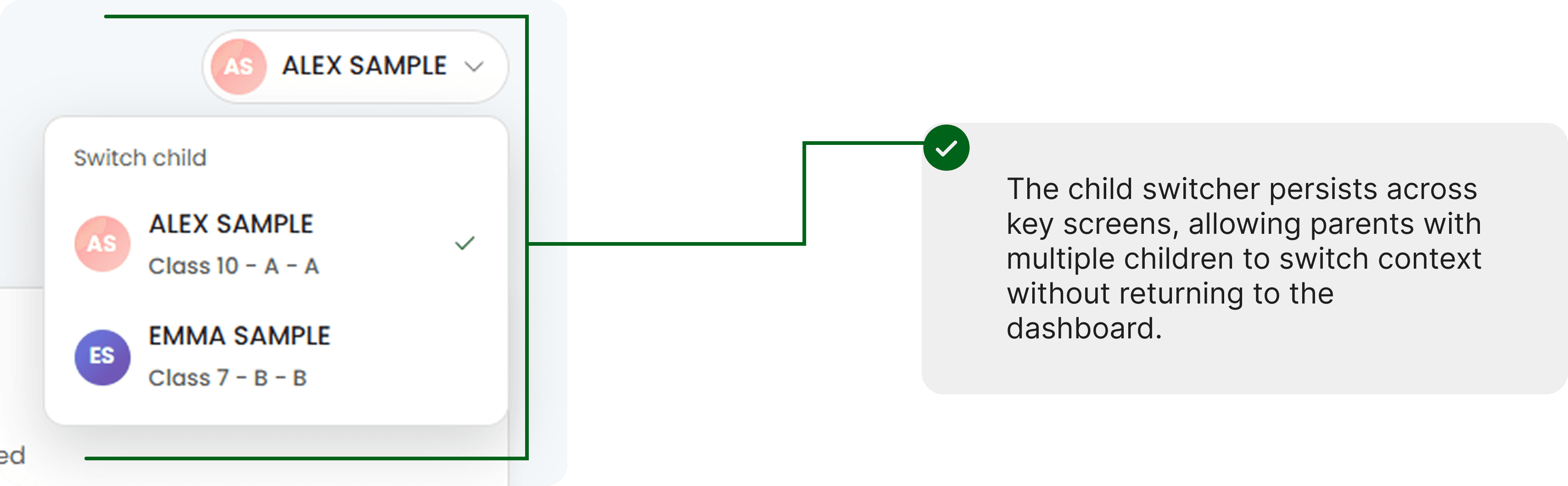
Navigation & Account Access

Responsive by Design
The interface adapts seamlessly across screen sizes, preserving hierarchy, navigation, and essential interactions as the layout transitions from desktop to smaller screens.
Final Design
The final interface builds on the validated structure, prioritizing the tasks parents use most while creating a clearer hierarchy and consistent interaction patterns across the portal.
Dashboard
The dashboard prioritizes the tasks parents access most frequently—attendance, fees, assignments, transport, and quick actions—so key information is available from a single overview.
Attendance Overview
Attendance was brought closer to the dashboard, reducing navigation and giving parents an immediate view of their child’s attendance status.
Fee Payment
Fee information was consolidated into a clearer payment flow, making outstanding balances, payment actions, and transaction history easier to scan and manage.
Assignments
Assignments were organized into scannable cards, allowing parents to quickly identify subjects, deadlines, and assignment status without opening each item.
Leave Request
Leave requests were organized into a clear status-based view, allowing parents to track submitted, approved, pending, and rejected requests at a glance.
Navigation & Account Access
Responsive by Design
The interface adapts seamlessly across screen sizes, preserving hierarchy, navigation, and essential interactions as the layout transitions from desktop to smaller screens.
Final Design
The final interface builds on the validated structure, prioritizing the tasks parents use most while creating a clearer hierarchy and consistent interaction patterns across the portal.
Dashboard
The dashboard prioritizes the tasks parents access most frequently—attendance, fees, assignments, transport, and quick actions—so key information is available from a single overview.
Attendance Overview
Attendance was brought closer to the dashboard, reducing navigation and giving parents an immediate view of their child’s attendance status.
Fee Payment
Fee information was consolidated into a clearer payment flow, making outstanding balances, payment actions, and transaction history easier to scan and manage.
Assignments
Assignments were organized into scannable cards, allowing parents to quickly identify subjects, deadlines, and assignment status without opening each item.
Leave Request
Leave requests were organized into a clear status-based view, allowing parents to track submitted, approved, pending, and rejected requests at a glance.
Navigation & Account Access
Responsive by Design
The interface adapts seamlessly across screen sizes, preserving hierarchy, navigation, and essential interactions as the layout transitions from desktop to smaller screens.
Reflection & Learnings
This project taught me that improving a complex product isn’t always about adding more features—it’s about making the right information easier to find, understand, and act on. Working across the parent portal helped me think more systematically about navigation, scalability, and consistency beyond individual screens.
01
Design for the real task
I learned to prioritize the actions parents need most rather than giving every feature equal visual weight. This helped shape the dashboard around everyday tasks such as attendance, fees, assignments, and transport.
02
Systems create consistency
Building the design system alongside the screens showed me how reusable tokens, components, and interaction patterns can make a large product more consistent and easier to scale.
03
Design beyond the current screen
Designing responsive layouts and planning space for future capabilities pushed me to think beyond the immediate interface and consider how the product could evolve over time.
What I’d improve
The redesign shipped without a post-launch measurement plan, so I have no outcome data to report. Priorities were set from the task frequency and pain mapping above rather than from usage analytics. If I continued this project, I would validate the redesigned flows with parents across different age groups and levels of digital familiarity. I would also measure task completion time, navigation effort, and error rates to understand whether the redesign actually reduced friction.
This project strengthened my approach to designing systems rather than isolated screens—and reminded me to always design around the user’s everyday context.
Reflection & Learnings
This project taught me that improving a complex product isn’t always about adding more features—it’s about making the right information easier to find, understand, and act on. Working across the parent portal helped me think more systematically about navigation, scalability, and consistency beyond individual screens.
01
Design for the real task
I learned to prioritize the actions parents need most rather than giving every feature equal visual weight. This helped shape the dashboard around everyday tasks such as attendance, fees, assignments, and transport.
02
Systems create consistency
Building the design system alongside the screens showed me how reusable tokens, components, and interaction patterns can make a large product more consistent and easier to scale.
03
Design beyond the current screen
Designing responsive layouts and planning space for future capabilities pushed me to think beyond the immediate interface and consider how the product could evolve over time.
What I’d improve
The redesign shipped without a post-launch measurement plan, so I have no outcome data to report. Priorities were set from the task frequency and pain mapping above rather than from usage analytics. If I continued this project, I would validate the redesigned flows with parents across different age groups and levels of digital familiarity. I would also measure task completion time, navigation effort, and error rates to understand whether the redesign actually reduced friction.
This project strengthened my approach to designing systems rather than isolated screens—and reminded me to always design around the user’s everyday context.
Reflection & Learnings
This project taught me that improving a complex product isn’t always about adding more features—it’s about making the right information easier to find, understand, and act on. Working across the parent portal helped me think more systematically about navigation, scalability, and consistency beyond individual screens.
01
Design for the real task
I learned to prioritize the actions parents need most rather than giving every feature equal visual weight. This helped shape the dashboard around everyday tasks such as attendance, fees, assignments, and transport.
02
Systems create consistency
Building the design system alongside the screens showed me how reusable tokens, components, and interaction patterns can make a large product more consistent and easier to scale.
03
Design beyond the current screen
Designing responsive layouts and planning space for future capabilities pushed me to think beyond the immediate interface and consider how the product could evolve over time.
What I’d improve
The redesign shipped without a post-launch measurement plan, so I have no outcome data to report. Priorities were set from the task frequency and pain mapping above rather than from usage analytics. If I continued this project, I would validate the redesigned flows with parents across different age groups and levels of digital familiarity. I would also measure task completion time, navigation effort, and error rates to understand whether the redesign actually reduced friction.
This project strengthened my approach to designing systems rather than isolated screens—and reminded me to always design around the user’s everyday context.

